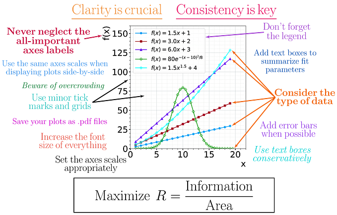
Behind the Viz: “Olympics” with Python and Tableau
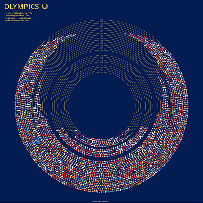
This DataViz was created with python using the vizmath PyPI package and visualized on 1 sheet in Tableau using map layers! It features a radial layout to show Summer Olympic participation by year and country.
What’s the vizmath python package?
This package was created by Nick Gerend and is a toolkit for creating complex visualizations. It contains a number of mathematical functions to calculate the positioning and drawing information for points, lines, and polygons in 2D and 3D along with various other helper methods. The output can be easily rendered in python or in another visualization tool, like Tableau!
Getting started with vizmath
We’ll create a python notebook that leverages the functions and draw modules from vizmath. The functions module contains various mathematical functions and algorithms to use for drawing points, and points is a dynamic module in the draw module, that will capture the data we need for drawing them and provide additional context with other data attributes.
For this viz, we’ll be using the circle and concentric_spread functions from functions, and some helper functions from the points objects to rescale the data, make preview plots, and generate dataframes to export the data for Tableau.
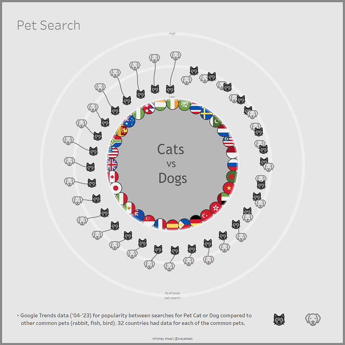
If you’ve see my previous article, “Behind the Viz: ‘Pet Search’”, you’ll notice that this version has some updates in regards to the previous rescaling functionality.
Overall, vizmath is easy to work with and a great time saver, let’s code!
Import packages
import os
import pandas as pd
from vizmath import functions as fun
from vizmath.draw import points as pts
import matplotlib.pyplot as plt
Read in data sourced from Kaggle¹
#https://www.kaggle.com/datasets/nitishsharma01/olympics-124-years-datasettill-2020?select=Athletes_summer_games.csv
df_summ = pd.read_csv(os.path.dirname(__file__) + '/Athletes_summer_games.csv')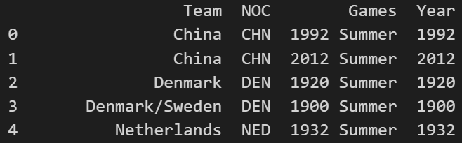
Setup some vizmath points objects and drawing variables
df_summ = df_summ.loc[df_summ['Year'] != 1906].copy(deep=True)
df_summ = df_summ.sort_values('Year', ascending=True)
df_summ['Gold'] = [1 if x == 'Gold' else 0 for x in df_summ['Medal']]
y = 100.
y_buff = 5.
y_max = y + (df_summ['Year'].nunique() + 3) * y_buff # add skipped years
list_xy = pts()
b_list_xy = pts()
year_counter = 1896
id = 1
idb = 1
scale = 6.1
Loop through each row (year & country) in the dataset and capture 2D points to represent the data and create a background layer
for year, group in df_summ.groupby('Year'):
    # account for skipped years
    if year != year_counter:
        steps = (year - year_counter)/4
        y += y_buff * steps
        year_counter = year
    # background
    circle_point_list = fun.circle(0, 0, points=300, r=y, end_cap=True)
    for cp in circle_point_list:
        b_list_xy.append(id=idb, x=cp[0], y=cp[1], path=cp[2], year=year)
        idb += 1
    # golds
    nat_evt = group.reset_index().groupby(['NOC','Event'])['Gold'].max().reset_index()
    nat_gold = nat_evt.groupby(['NOC'])['Gold'].sum().reset_index()
    # athletes
    nat_ath = group.groupby(['NOC'])['Name'].nunique().reset_index()
    # events
    events = group.groupby(['NOC'])['Event'].nunique().reset_index()
    events_tot = group['Event'].nunique()
    # join
    df_year = nat_gold.merge(nat_ath, on='NOC', how='left')
    df_year = nat_gold.merge(events, on='NOC', how='left')
    df_year['Events_Total'] = events_tot
    # setup
    country_count = df_year.shape[0]
    country_points = fun.concentric_spread(y, scale, country_count, style='gravity')
    # draw
    p = 0
    for r, row in df_year.sort_values(by=['Gold'], ascending=False).iterrows():
        cx = country_points[p][0]
        cy = country_points[p][1]
        list_xy.append(id=id, x=cx, y=cy, path=p+1, year=year, country=row['NOC'], golds=row['Gold'], events=row['Event'], events_total=row['Events_Total'])
        id += 1
        p += 1
    y += y_buff
    year_counter += 4
Create dataframes from both vizmath points and rescale each
list_xy.to_dataframe()
b_list_xy.to_dataframe()
extent = max(list_xy.df['x']) + 10 # buffer
list_xy.dataframe_rescale(-extent, extent, -extent, extent)
b_list_xy.dataframe_rescale(-extent, extent, -extent, extent)
list_xy.df.head() #preview the dataframe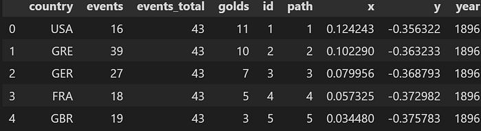
Plot the vizmath points object containing the plotting information for years and countries of the Summer Olympics
list_xy.plot_xy()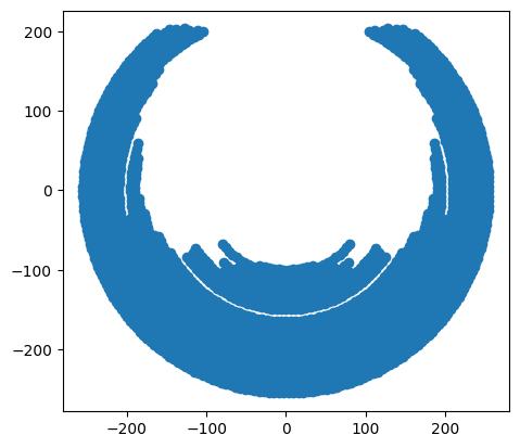
Plot the rescaled version as a test before bringing the output into Tableau
#%% test plot
x = [r['x'] for o, r in list_xy.df.iterrows()]
y = [r['y'] for o, r in list_xy.df.iterrows()]
plt.scatter(x, y)
plt.gca().set_aspect('equal', adjustable='box')
plt.show()
list_xy.dataframe_to_csv('viz_chart_summer')
b_list_xy.dataframe_to_csv('viz_background_summer')
All done, bring the csv files into Tableau and add the points to map layers!
Building this in Tableau is easy with map layers! We’ll get started by importing the data we generated with python and create some calculated columns to pull in to map layers.
Import the viz_chart_summer.csv and create the following calculated fields:
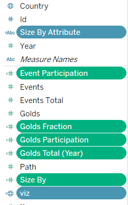
Size By Attribute: [Size Selector]
Event Participation: [Events]/[Events Total]
Golds Fraction: [Golds]/[Golds Total (Year)]
Golds Participation: [Golds]/[Events]
Golds Total (Year): {fixed [Year] : sum([Golds])}
Size By: case [Size Selector]
when ‘Gold Medal Participation’ then [Golds Participation]
when ‘Gold Medal Fraction’ then [Golds Fraction]
when ‘Event Participation’ then [Event Participation]
when ‘None’ then .05
end
viz: MAKEPOINT([Y],[X])
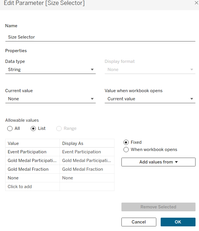
Parameter: [Size Selector]
Import the viz_background_summer.csv and create the following calculated fields:
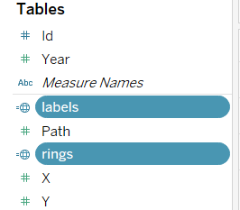
labels: if [Path] = 1 then [rings] else NULL end
rings: MAKEPOINT([Y],[X])
Prepare custom shapes
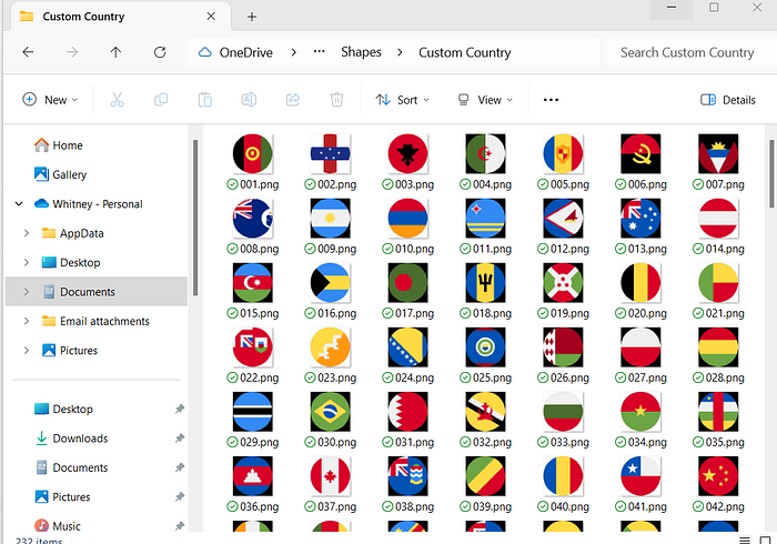
Now we need to source some icons for the viz. My favorite sources for icons are phosphoricons and flaticon. After saving icons to your computer, add them to the Shapes folder in your Tableau Repository.
For this viz, I created a sub-folder in the Shapes folder which contains the groups of shapes I need: “Country”. After adding in a sub-folder in Shapes, you’ll need to click Reload Shapes for the folders to appear in Tableau.
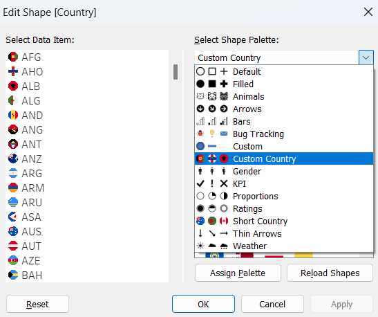
Note: For the country icons, Tableau auto arranges the Data Item list alphabetically, so a quick hack here is naming each country icon numerically in a 001, 002, 003 format.
Build the viz!
From the viz_chart_summer data source, drag viz on to the worksheet to generate latitude and longitude. Next, add year (change to a discrete dimension) as a detail. Set the type to Shape and drag Country to shape. Assign icons accordingly. Disable all background map layers and map options.
From the viz_background_summer data source, drag labels on to the worksheet as a new layer. Change the type to a square and add Year to the text label. Change Year to discrete. Adjust the color and sizing of the shape bar for year and its label to your liking.
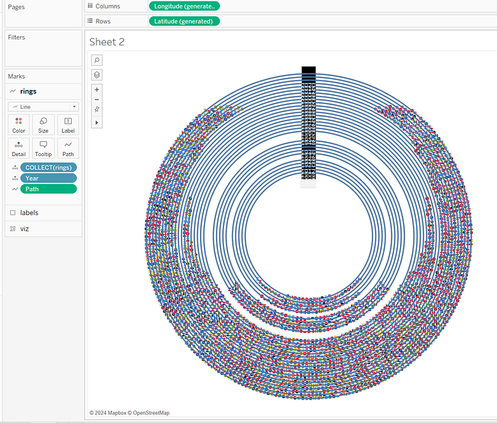
From the viz_background_summer data source, drag rings on to the worksheet as a new layer. Change the type to line and add Year as a discrete dimension. Drag Path to path and change it to a dimension. Adjust the size and coloring to your liking.
That’s it! The viz is ready to be turned into a dashboard. You can download the original viz here for further exploration.
References
All images in this article were created by the author unless otherwise stated.
[1] Kaggle “120 years of Olympic history: athletes and results”
[2] Wikipedia “Summer Olympic Games”
Related Articles