Behind the Viz: “Pet Search” with Python and Tableau
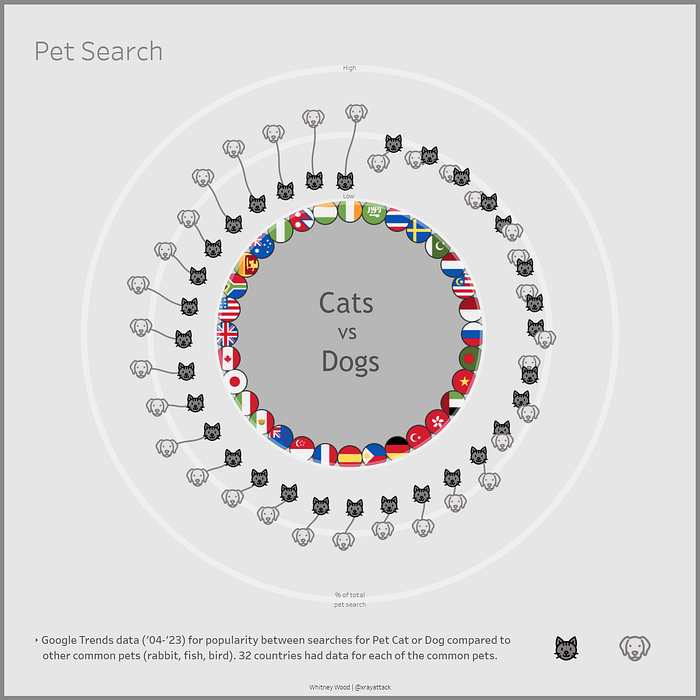
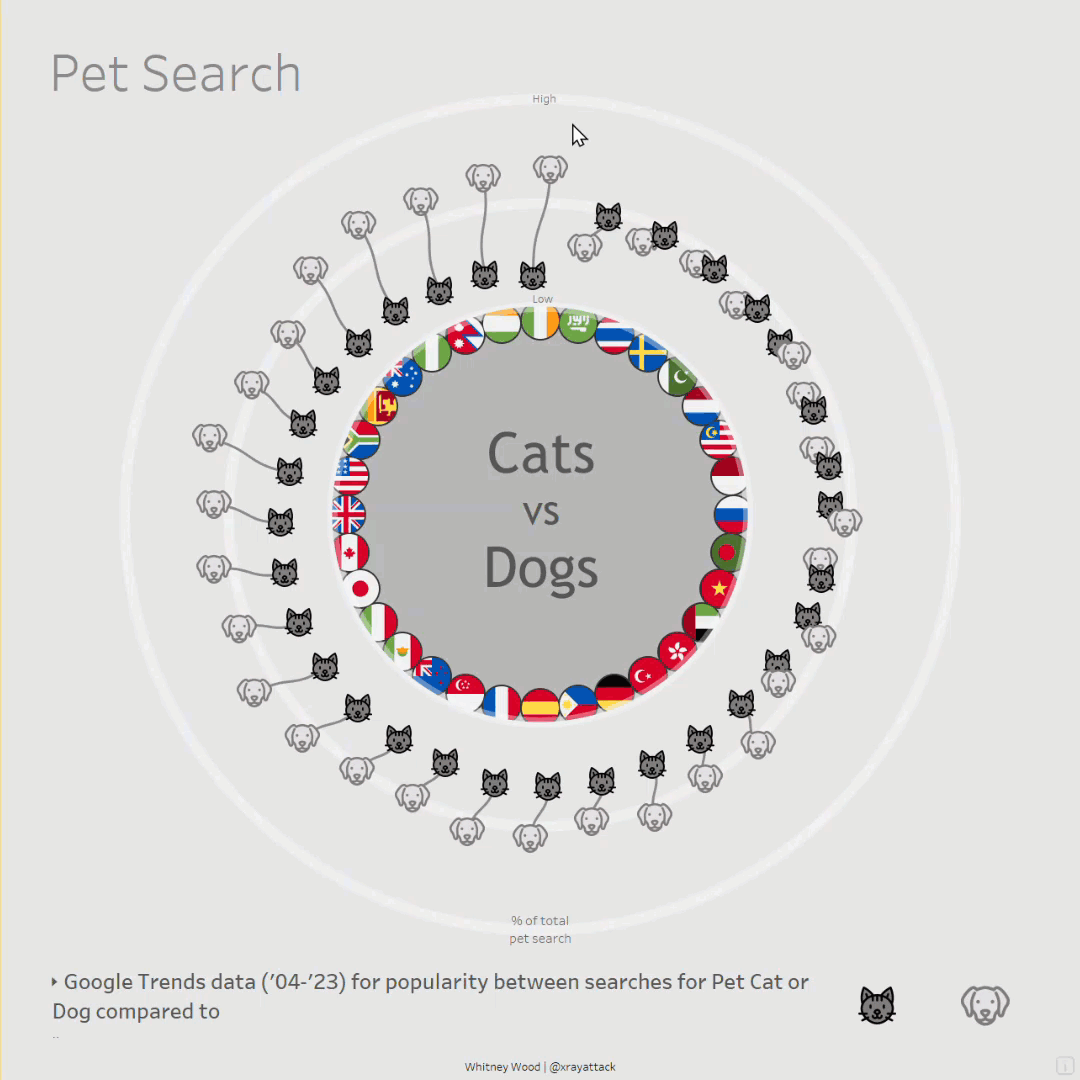
This DataViz was created with python using the vizmath PyPI package and visualized on 1 sheet in Tableau using map layers! It features a radial layout and sigmoid curve connections to show the relationship between cat and dog searches as a percent of total common pet searches.
What’s the vizmath python package?
This package was created by Nick Gerend and is a toolkit for creating complex visualizations. It contains a number of mathematical functions to calculate the positioning and drawing information for points, lines, and polygons in 2D and 3D along with helper methods for adding context and transformations. The output can be easily rendered in python or in another visualization tool, like Tableau!
Getting started with vizmath
We’ll create a python notebook that leverages the vmath and points classes from vizmath. The vmath class contains various mathematical functions and algorithms to use for drawing points, and points is a dynamic class that will capture the data we need for drawing them and providing context.
For this viz, we’ll be using the polarize and sigmoid functions from vmath, and some helper functions from the points objects to rescale the data, make preview plots, and generate dataframes for exporting the data for Tableau.
Overall, vizmath is easy to work with and a great time saver, let’s code!
Import packages
import pandas as pd
from vizmath import vmath, points #pip install vizmath==0.0.6
Read in data sourced from Google Trends
# From Google Trends: 2004-2023 popularity between searches for Pet Cat or Dog compared to other common pets (rabbit,fish,bird) for 32 countries that returned data
df = pd.read_csv('catsdogs.csv') # pandas read
df.head() # preview data: Country (will visualize each country's flag), cat (search %), dog (search %)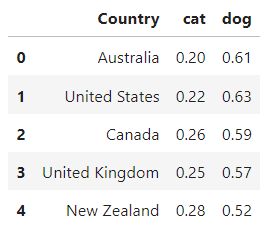
Setup some vizmath classes and drawing variables
vm = vmath() # will use to call some vizmath functions
catdog_flags = points() # vizmath object to hold data for drawing nation flags
catdog_sigmoid = points() # vizmath object to hold data for drawing cat-dog connections
x_max = df.shape[0] # save the row count (number of countries)
y_min = 1 # setup an offset to use as a radius
x = 0 # setup an offset to draw seperate each country
Loop through each row (country) in the dataset and capture 2D points to represent the data
for i, row in df.sort_values(by=['cat'], ascending=False).iterrows(): # sort values by the cat percentage
    x += 1 # start at 1 and increment at 1
    y_cat = row['cat'] # cat percentage
    y_dog = row['dog'] # dog percentage
    country = row['Country'] # country

    cs = 1 # setup a jitter order constant in case of 2 points (a country's cat and dog values) being too close together
    if y_cat < y_dog: # adjust constant based on the animal with the higher value
        cs = -1
    xci = x+.15*cs # jitter by a placement constant of .15 for cats
    xdi = x+.15*(-cs) # same as above for dogs
    xc,yc=vm.polarize(xci,x_max,y_cat+y_min) # use the vizmath function to convert cartesian to polar coordinates (cats)
    xd,yd=vm.polarize(xdi,x_max,y_dog+y_min) # same as above (dogs)
    xf,yf=vm.polarize(x,x_max,-0.065+y_min) # use the vizmath function to convert cartesian to polar (country flags)
    catdog_flags.append(id=country,x=xc,y=yc,path=0,animal='cat',value=y_cat,country=country) # add data to vizmath object for cats
    catdog_flags.append(id=country,x=xd,y=yd,path=1,animal='dog',value=y_dog,country=country) # same for dogs
    catdog_flags.append(id=country,x=xf,y=yf,path=-1,animal='flag',value=0,country=country) # same for country flags
    sig = vm.sigmoid(xci, y_cat+y_min, xdi, y_dog+y_min, 20, orientation = 'v', limit = 4) # use the vizmath function to draw points along a sigmoid path
    sp = 1 # setup a sigmoid point id
    y_diff = abs(y_cat-y_dog) # get the seperation value between each cat and dog as an interesting data point to store
    for sx, sy in sig: # iterate through each sigmoid point
        sxp,syp=vm.polarize(sx,x_max,sy) # convert each sgmoid point to polar coordinates
        catdog_sigmoid.append(id=country,x=sxp,y=syp,path=sp,animal='connection',value=y_diff,country=country) # add data to vizmath object for connections
        sp += 1 # iterate the sigmoid point id
Plot the vizmath object containing the data for cats, dogs, and country flags
catdog_flags.plot_xy()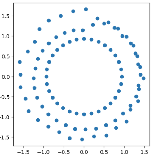
Plot the vizmath object containing the data for cat-dog connections
catdog_sigmoid.plot_xy()
Create dataframes from both vizmath objects and rescale each between -1 and 1 (default)
catdog_flags.to_dataframe() # add a dataframe version of the data to the vizmath object
catdog_flags.dataframe_rescale(xmin=-2,xmax=2,ymin=-2,ymax=2) # rescale the x-y space (for Tableau's map layers)

catdog_sigmoid.to_dataframe() # same as above
catdog_sigmoid.dataframe_rescale(xmin=-2,xmax=2,ymin=-2,ymax=2) # same as above
catdog_flags.df.head() # preview the dataframe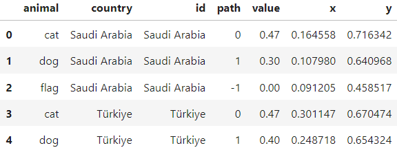
catdog_sigmoid.df.head() # preview the dataframe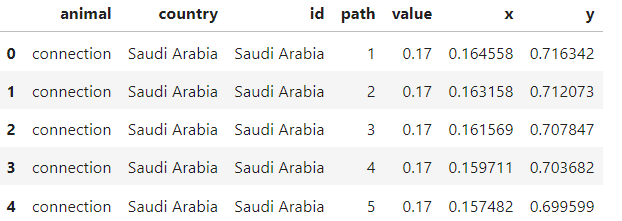
Write out the vizmath dataframes to csv files
catdog_flags.df.to_csv('catsdogs_radial.csv', encoding='utf-8', index=False) # pandas write
catdog_sigmoid.df.to_csv('catsdogs_radial_connections.csv', encoding='utf-8', index=False) # pandas write
Create a background to finish out the viz
radial_background = points() # vizmath object to hold the data
for i in (0., 0.5, 1.): # let's create 3 circles a reference lines in the viz
    circle_point_list = vm.circle(0, 0, points=300, r=i+y_min, end_cap=True) # vizmath function for creating circle points
    for cp in circle_point_list: # loop through each circle point
        radial_background.append(id=i, x=cp[0], y=cp[1], path=cp[2]) # add data to the vizmath object
radial_background.to_dataframe() # add a dataframe version of the data to the vizmath object
radial_background.dataframe_rescale(xmin=-2,xmax=2,ymin=-2,ymax=2) # rescale the x-y space (for Tableau's map layers)
radial_background.df.head() # preview dataframe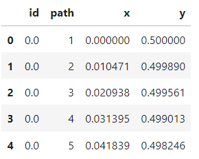
radial_background.plot_xy() # plot the vizmath object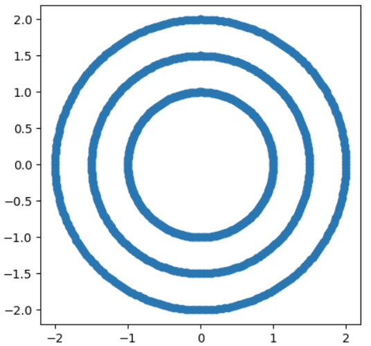
radial_background.df.to_csv('catsdogs_radial_background.csv', encoding='utf-8', index=False) # pandas writeAll done, bring the csv files into Tableau and add the points to map layers!
Building this in Tableau is easy with map layers! We’ll get started by importing the data we generated with python and create some calculated columns to pull in to map layers.
Import the catsdogs_radial.csv and create the following calculated fields:
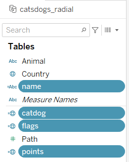
name: [country]
catdog: if [Animal] != ‘flag’ then [points] else null end
flags: if [Animal] = ‘flag’ then [points] else null end
points: MAKEPOINT([Y],[X])
Import the catsdogs_radial_background.csv and create the following calculated fields:
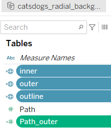
inner: if [Percent] = 0 then [outline] else null end
outer: if [Percent] != 1 then [outline] else null end
outline: MAKEPOINT([Y],[X])
Path_outer: if [Percent] = .5 then [Path] else -[Path] end
Import the catsdogs_radial_background_connections.csv and create the following calculated fields:
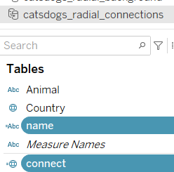
name: [country]
connect: MAKEPOINT([Y],[X])
Prepare custom shapes
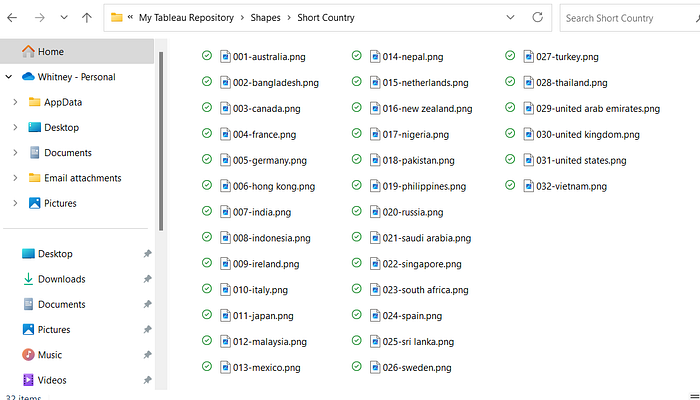
Now we need to source some icons for the viz. My favorite sources for icons are phosphoricons and flaticon. After saving icons to your computer, add them to the Shapes folder in your Tableau Repository.
For this viz, I created 2 sub-folders in the Shapes folder which contain the groups of shapes I need: “Animals” and “Short Country”. After adding in a sub-folder in Shapes, you’ll need to click Reload Shapes for the folders to appear in Tableau.
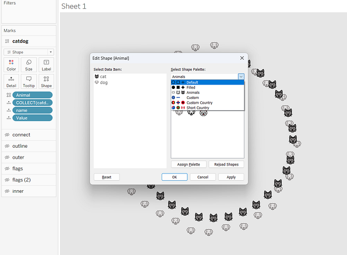
Note: For the country icons, Tableau auto arranges the Data Item list alphabetically, so a quick hack here is naming each country icon numerically in a 001, 002, 003 format.
Build the viz!
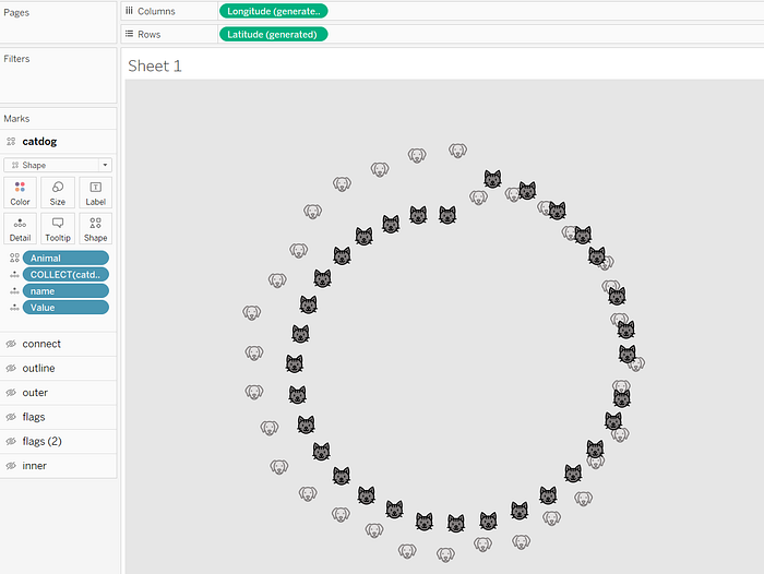
From the catsdogs_radial data source, drag catdog on to the worksheet to generate latitude and longitude. Next, add name and Value (change to a discrete dimension) as details. Set the type to Shape and drag Animal to shape. Assign icons accordingly. Change the pane shading to grey and disable all background map layers and map options.
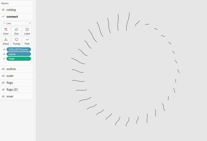
From the catsdogs_radial_connections data source, drag connect on to the worksheet as a new layer. Change the type to a line and add name to detail, and Path to path as a dimension. Change the color to a darker grey.
From the catsdogs_radial_background data source, drag outline on to the worksheet as a new layer. Change the type to line and add Percent to detail, and Path to path as a dimension. Color this white with an opacity of 35% and increase the size to desired line width.

From the catsdogs_radial_background data source, drag outer on to the worksheet as a new layer. Change the type to polygon and add Path_outer to path as a dimension. Color it the same grey as the pane background. Note: Color changed below for reference.

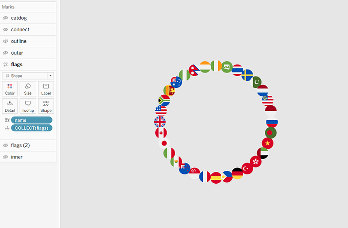
From the catdogs_radial data source, drag flags on to the worksheet as a new layer. Change the type to shape and add name to shape. Now you can assign country icons to the shapes.
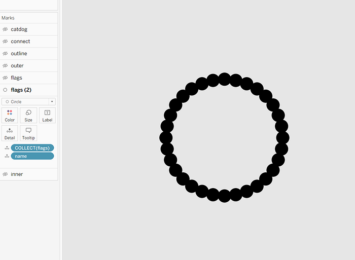
Drag flags to the worksheet again as a new layer. Change the type to circle and add name to detail. This will create a background border for the flag shapes. Set the color to black.
From the catsdogs_radial_background data source drag inner onto the worksheet as a new layer. Change the type to polygon and add Path to path as a dimension. This creates an inner circle that you can apply a unique color to. Set the color to dark grey.

That’s it! The viz is ready to be turned into a dashboard. You can download the original viz here for further exploration.
Find the complete code here on GitHub. Thanks for reading!